What Your Brand Colour Says About You!
Blue — Trust, Stability, Professionalism 
Blue is the world’s most universally liked colour. It’s calm, dependable, and safe — perfect for brands that want to build trust and feel established.
Used by: Facebook, PayPal, IBM, Ford
Best for: finance, tech, healthcare, corporate brands
Emotional tone: trustworthy, secure, intelligent
Black — Luxury, Sophistication, Modern 
Black is bold, minimal, and timeless. It’s the go-to for premium brands that want to feel sleek and confident.
Used by: Chanel, Nike, Apple (often in product packaging), Prada
Best for: fashion, boutique brands, modern startups
Emotional tone: elegant, powerful, refined
White — Simplicity, Cleanliness, Freshness 
White brings clarity and space. It’s often used as a base colour to highlight other tones or create a minimalist feel.
Used by: Apple, The Honest Company, Glossier
Best for: wellness, beauty, lifestyle, minimalist brands
Emotional tone: pure, simple, honest
Red — Energy, Passion, Urgency 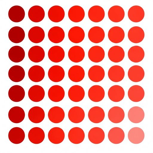
Red grabs attention instantly. It’s emotional, bold, and high-impact — ideal for brands that want to spark action.
Used by: Coca-Cola, Netflix, YouTube, Target
Best for: food, sports, entertainment
Emotional tone: passionate, energetic, daring
Green — Growth, Balance, Nature 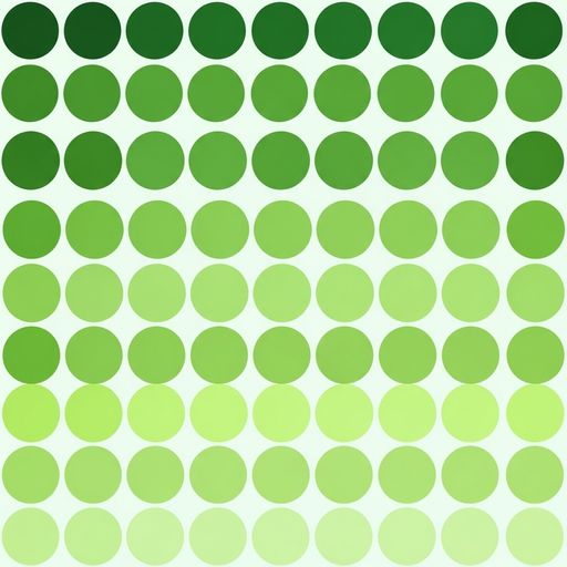
Green is soothing and grounded. It’s tied to health, sustainability, and renewal — perfect for eco-conscious brands.
Used by: Whole Foods, Spotify, Tropicana, Animal Planet
Best for: wellness, agriculture, finance
Emotional tone: natural, balanced, fresh
Yellow — Optimism, Warmth, Creativity 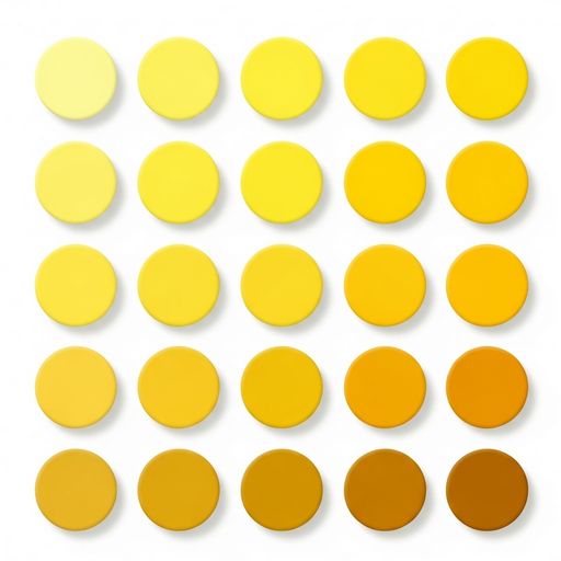
Yellow is cheerful and uplifting — but best used in moderation. It’s great for brands that want to feel friendly and imaginative.
Used by: McDonald’s, IKEA, Snapchat, National Geographic
Best for: creative brands, children’s products, lifestyle companies
Emotional tone: joyful, approachable, inventive
Purple — Creativity, Luxury, Imagination 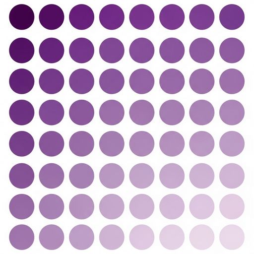
Purple blends the calm of blue with the energy of red. It’s often used by brands that want to feel artistic or premium.
Used by: Cadbury, Hallmark, Twitch, Yahoo
Best for: beauty, wellness, creative industries
Emotional tone: imaginative, elegant, unique
Orange — Confidence, Fun, Approachabilit 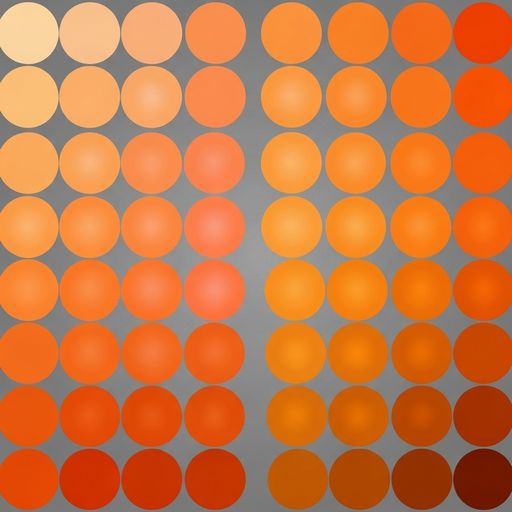
Orange is energetic without being aggressive. It’s playful and inviting — perfect for brands that want to feel bold but friendly.
Used by: Fanta, Harley-Davidson, Nickelodeon, Etsy
Best for: startups, fitness, entertainment
Emotional tone: enthusiastic, vibrant, social
Pink — Warmth, Femininity, Modern Softnes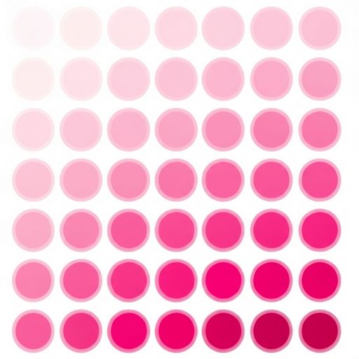
Pink has evolved far beyond “girly.” Depending on the shade, it can feel edgy, modern, or nurturing.
Used by: Barbie, Victoria’s Secret, T-Mobile, Canva
Best for: beauty, lifestyle, boutique brands
Emotional tone: expressive, caring, contemporary
Our Final Thought
Every colour tells a story. The key is choosing one that matches your brand’s personality and resonates with your audience. Whether you’re building a logo, designing merchandise, or selecting embroidery threads, colour is your first impression — make it count!
Want help choosing a palette that feels authentic and stitch-ready? Let’s collaborate — DM us info@emblemandedge.ca